Which led me to the website, www.horvatland.com
Which led me into what could be called an obsession. I've been sitting here for two hours just LOOKING at his works.
I've always been loosely interested in fashion photography, and I have a lot of admiration of the current crop of fashion photographers. But I think this could be a defining moment in my consciousness where fashion photography actually REALLY moved me.
This one is my favourite -

It has the smoky, languid feel of a bygone era, a great photograph on its own and all the better for not neglecting to focus on the fashion, which I always think is necessary. I hate fashion photos that make the clothing feel like an afterthought. The photos are beautiful on their own in terms of composition and lighting and all that, but it doesn't forget to make you ask - who did that dress?
This one, taken some 15-odd years later, has the same nonchalant feel, even though the clothes and setting are completely different.
I love any photography that has a feel of movie still - like you've captured something happening at a pivotal moment. Photos like that are so charged and make you wonder about the story behind it and sets your over-active imagination going - that's a photo that works for me.
This one is fabulous that way -
This one is fabulous that way -
I love the slightly tense expression of her face, and the man jutting at the fore of the picture makes it feel so spontaneous and fleeting - as though the photographer only had one brief hurried attempt at capturing her before someone else blocks his view.
It reminds me of the street fashion blogs that are getting so popular these days - it feels very candid and that's always inspiring. No bad for a photo taken in the 1960s.
It reminds me of the street fashion blogs that are getting so popular these days - it feels very candid and that's always inspiring. No bad for a photo taken in the 1960s.
This one feels really charged -
She looks so cool and composed while the man looks rather agitated. It's a very intriguing photograph. And it's a fashion spread. Not many fashion spreads intrigued me like this very often.
This one perfectly exemplifies the kind of spontaenity Mr Horvat did so well -
This is pure elegance -
And this one is pure dash -
At the same time I like a touch of portraiture; you can see why I like Mr Horvat's work -
I love it when portraiture is deliberately and consciously used - again it adds charge to a photo and has that touch of grandeur (or grandoisity) that always gives a feel of sadness, or even tragedy, like Jacobean drama.
There's also a sense of humour and playfulness to his work -
This one reminds me of a spread that appeared in American Vogue a few years ago, with the Proenza Schouler duo posing with a llama -
His work feels very modern - see the parallels between this -
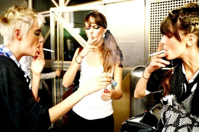
And this with Irina, Agyness, and Freja by Matt Irvin of Less Common -
I dont really have anything to say about this one, except that it's just beautiful, haunting, and nostalgic. And I mean nostalgic in a good way, not the kitsch way.
I'm intrigued and just a tad disturbed by the presence of men in so many of his fashion photos. Often, where men are involved, the women appear to play this secondary, decorative, trophy-wife role.
Unless of course, the men are actually the focus of the shoot - perhaps they are well-known personalities and I just don't recognise them.
There are lots and lots to see at the website - Go there, be awed, and be inspired.
There are lots and lots to see at the website - Go there, be awed, and be inspired.
Pictures taken from www.horvatland.com; http://www.myspace.com/lesscommonmoresense
horvatland


Reviewed by just4u
Published :
Rating : 4.5
Published :
Rating : 4.5


